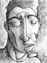


Which way do you like right-side up best? Help me out. Deciding which way is up in my abstracts is a real joy for me and a great way to hone the eyes...
A collection of thoughts and images from the singular mind of Ray Swaney, artist/poet/who-man being.

6 comments:
2nd view the most logical (for me)
third view looks the best
The uprights are the best.
I keep reading the title of this blog as "Art Vs. Ray", which would also be good. "Art Bites Man" I also like.
oh yes!
I like the third one from the top (1st choice) and the second one from the top (2nd choice).
#2 and #3 are best, IMO
#3!
Numero tres, senor, es mi favorito.
Post a Comment